
IncuBox
Industry: Financial modelling & advisory
Services: Visual identity, document design, Stationery, web design, financial model interface
All content shown across IncuBox collateral is fictional. Client content is confidential.
Designed for decisions.
The challenge
IncuBox is a financial modelling and advisory business built around a proprietary decision-support framework - the IncuBox Value Advantage™ - that helps founders and business leaders understand how decisions shape cashflow, economic value and capital efficiency. The brief was to build a brand and collateral suite that matched the rigour of the advisory itself: precise and confident, without feeling institutional or cold.
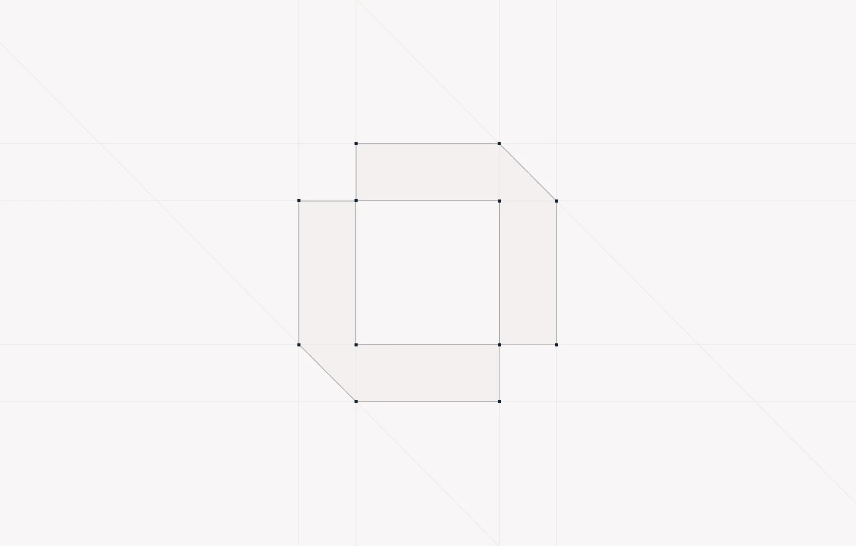
Logo anatomy
The mark
The logo replaces the "O" in IncuBox with a geometric box form - a direct reference to the name, but also to the Excel cell, the building block of every financial model. The mark has a precise, almost mathematical quality. The chamfered corners on the top right and bottom left are not decorative - they introduce a directional shift into an otherwise structured form, reflecting the moment a decision changes the trajectory of a business.
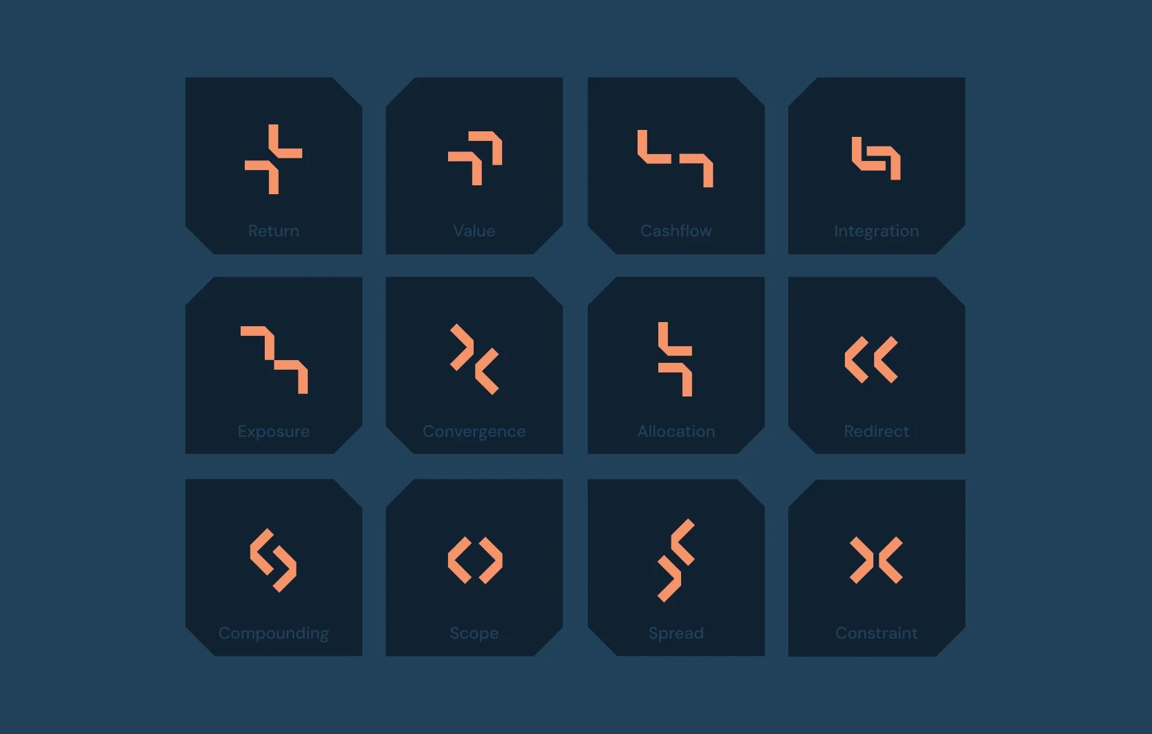
Icon set
Landing page
Web & Imagery
The same visual language runs consistently across all IncuBox collateral - from the pitch deck background to supporting imagery throughout the suite - created and adapted using AI tools to maintain coherence at every touchpoint.
The pairing of fluid, organic forms with a precise geometric brand system is intentional. The imagery brings warmth and movement to what could otherwise feel like a cold, technical brand - while the geometric rigour of the logo and icon system anchors it. The contrast between the two reflects the nature of the advisory itself: structured thinking applied to situations that are anything but static.
The full website is currently in development.
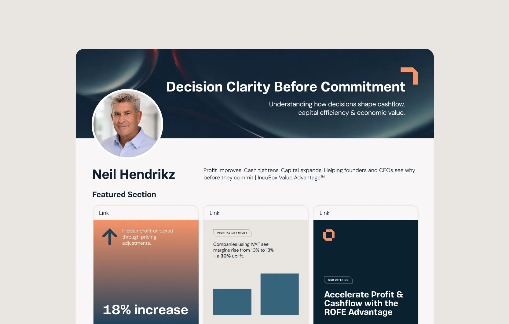
LinkedIn profile
Colour
The colour logic reflects the positioning of the advisory. The orange carries warmth and human judgment - the quality of a trusted advisor. The deep navy brings precision and authority. Neither dominates; they work in tension, which is exactly where IncuBox operates. The gradient bridges the two ends of the palette - making the relationship between warmth and precision explicit rather than implied.
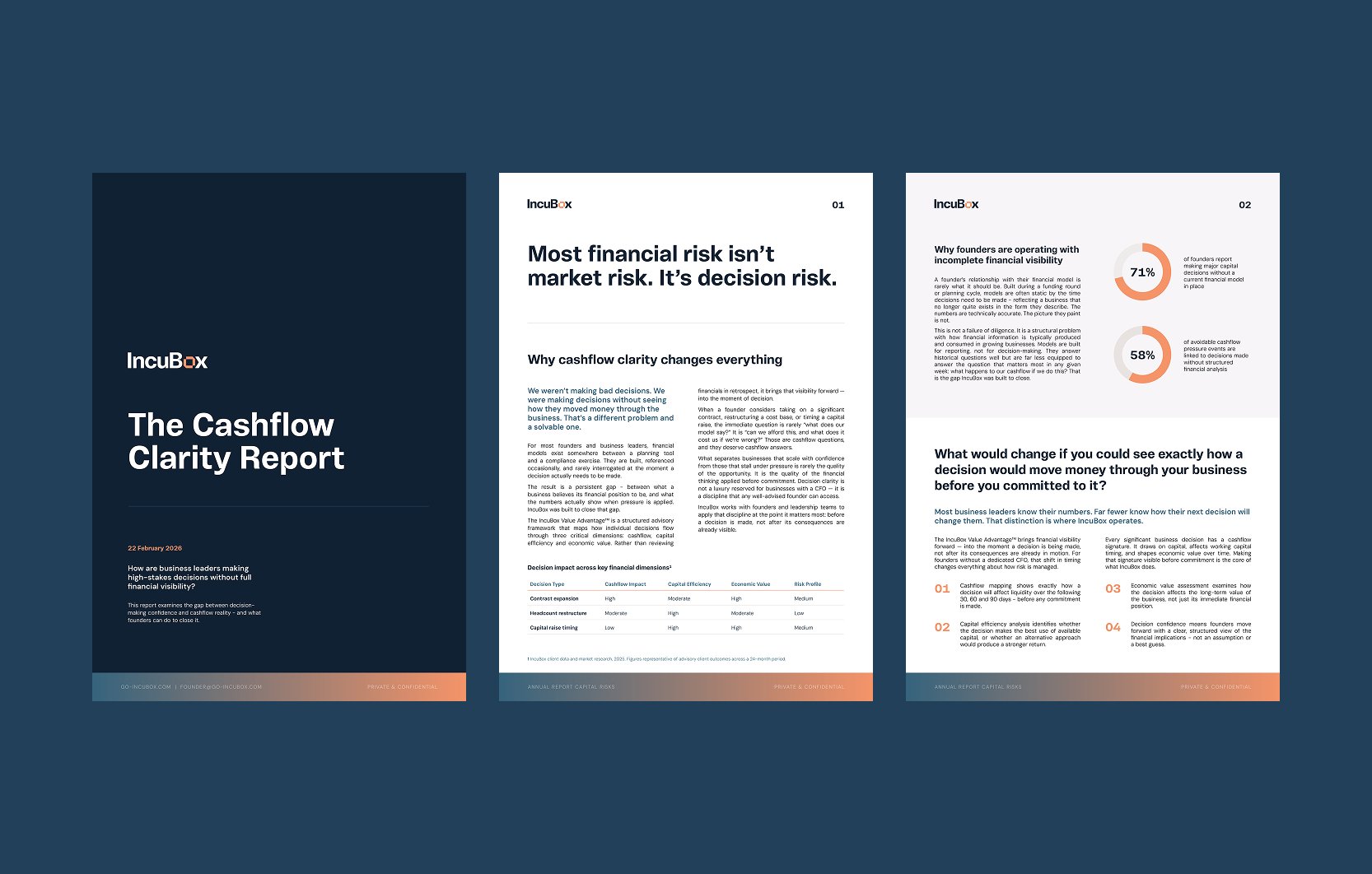
Report
Emailer
Emailer
The newsletter brings the brand into an email context - structured, hierarchy-led and designed within the constraints of email rendering to maintain visual integrity across clients and devices.
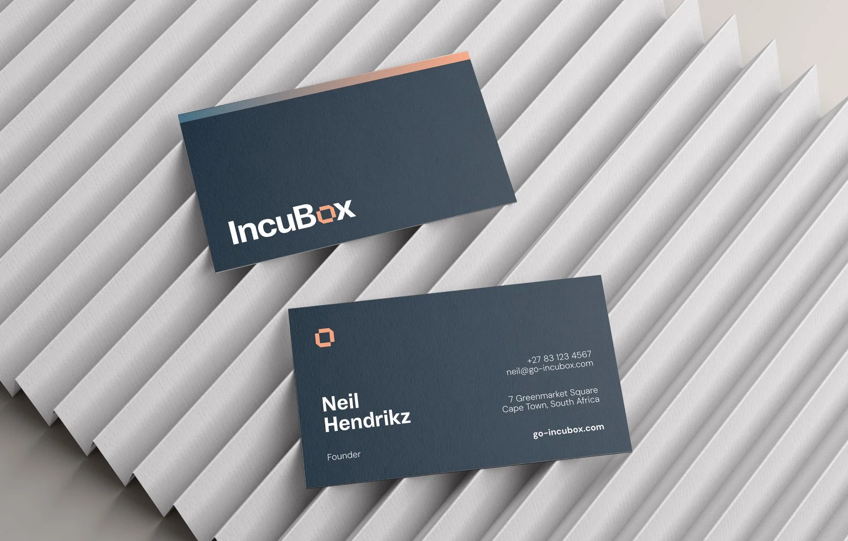
Business cards
Start a project
Building a brand that needs to work as hard as your business does?
We design for founders and professionals who can't afford to look like they're still figuring it out.