
SecondNature
Industry: Sustainability consulting / Impact & ESG advisory
Services: Visual identity, website design
Guiding organisations toward lasting impact.
The challenge
SecondNature was conceived as a new sustainability consultancy entering a crowded and often visually generic market. The challenge was to create a brand and website that felt credible and knowledgeable without appearing overly institutional, while appealing to startups and younger decision-makers. At the same time, the identity needed to clearly differentiate itself from traditional “green” sustainability branding, communicating long-term thinking and systems-level impact in a contemporary, digitally fluent way.
Logo & imagery
The Approach
The concept for SecondNature was built around the idea of integration - positioning sustainability as something embedded into how organisations operate and evolve. Rather than relying on purely natural or ethical cues, the brand frames sustainability at the intersection of technology, strategy and modern business thinking. This informed a grounded visual direction paired with a clear, editorial-style website that makes the consultancy’s philosophy feel accessible.
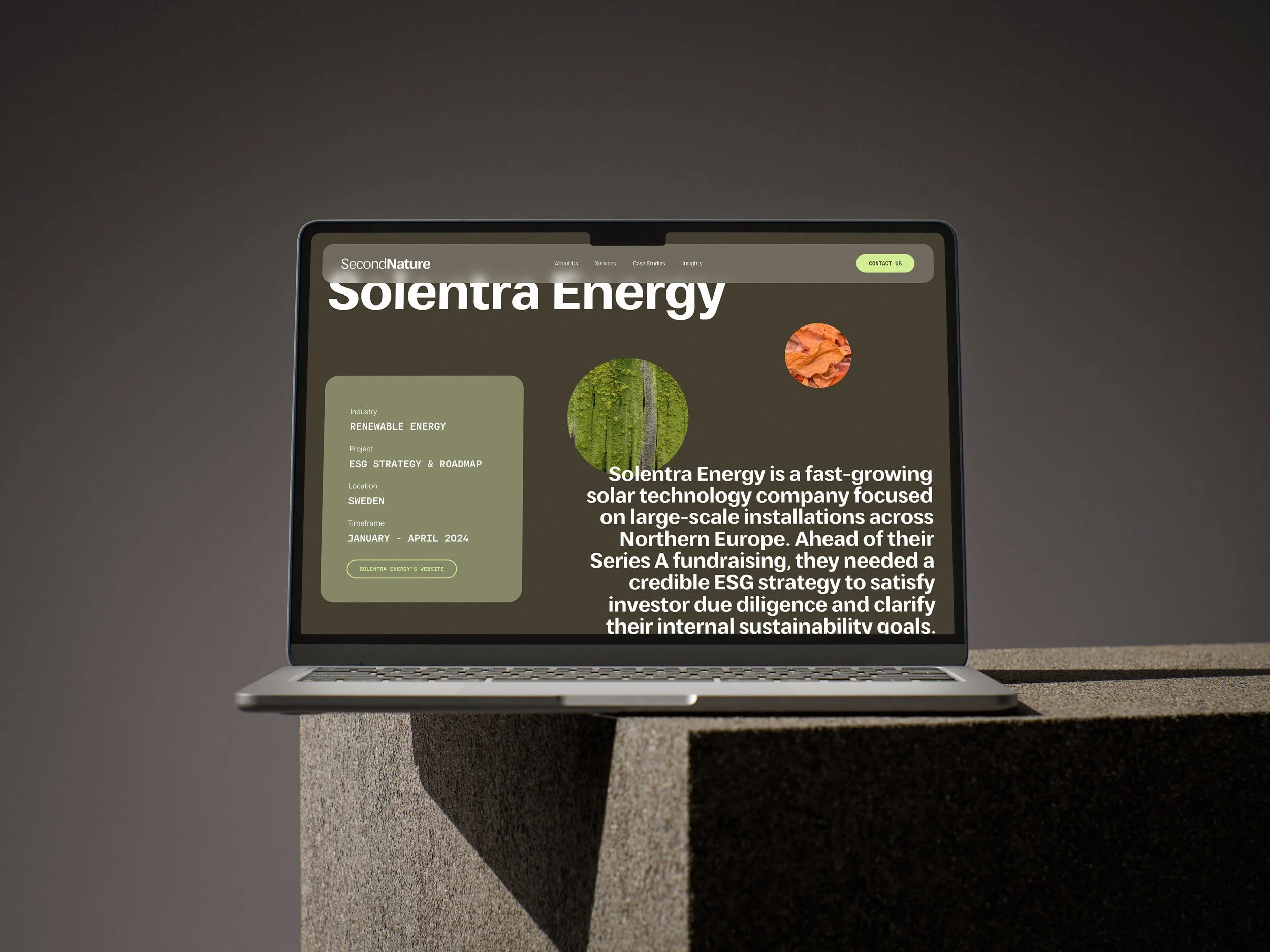
Case study page
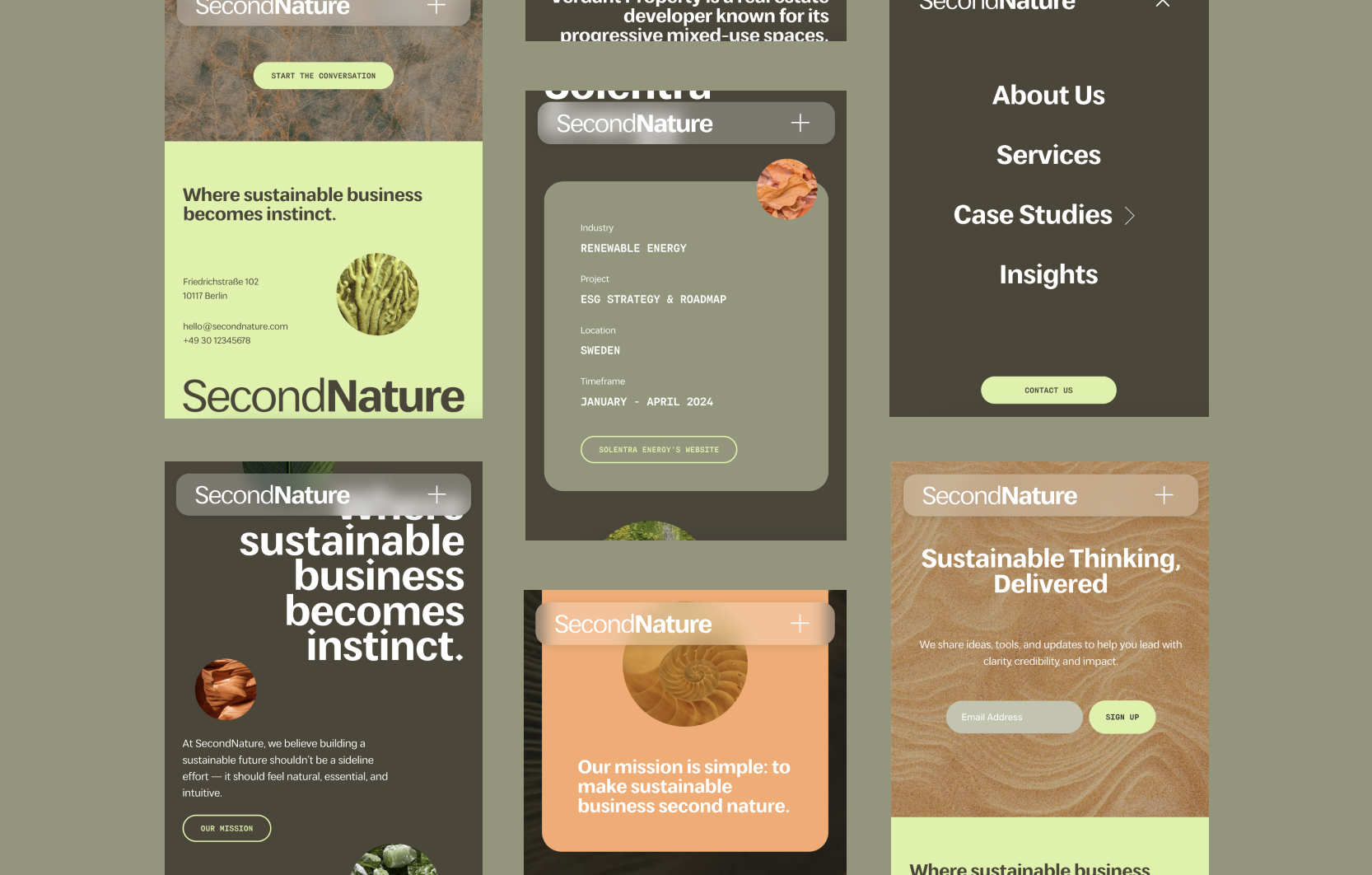
Mobile
Button & navigation hover state
Visual identity
The colour palette combines earthy and high-contrast tones to reflect the dual nature of the consultancy. Brown and olive green ground the brand in longevity and environmental thinking, while lime green and peach introduce energy, optimism and a subtle tech-forward edge. Together, they position SecondNature at the intersection of sustainability and modern, scalable business strategy.
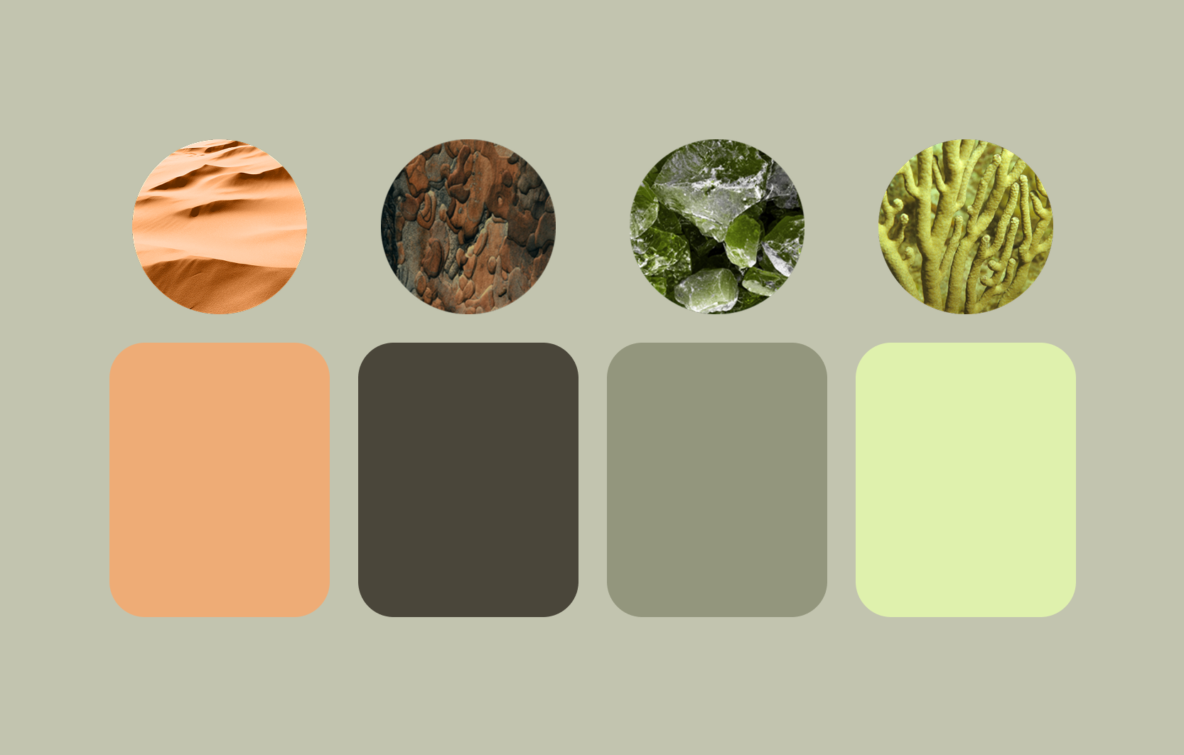
Colours, imagery & textures
Imagery & texture
Imagery focuses on close-up details of natural elements, treated more as textures than literal representations of landscapes or ecosystems. This avoids common sustainability clichés and creates a tactile, considered visual language that reinforces the idea of closely examining systems, materials and processes. All imagery sits within the same tonal range as the palette, creating a cohesive experience across the site.
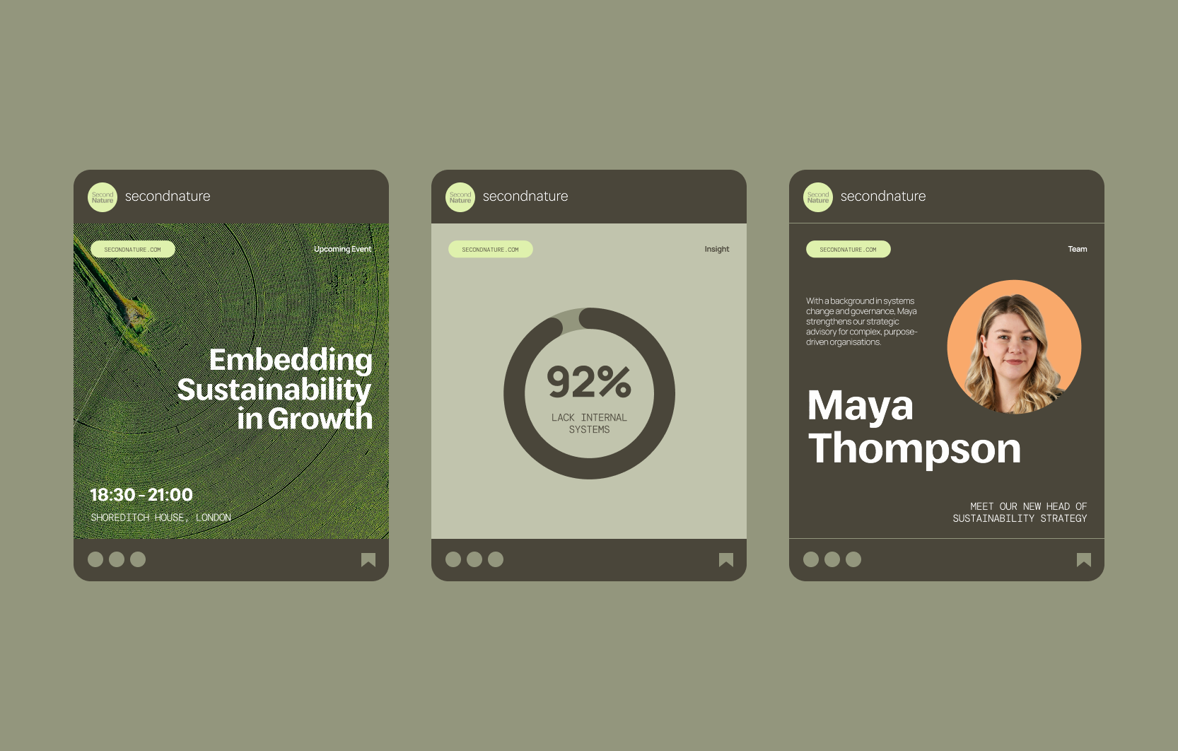
Instagram posts
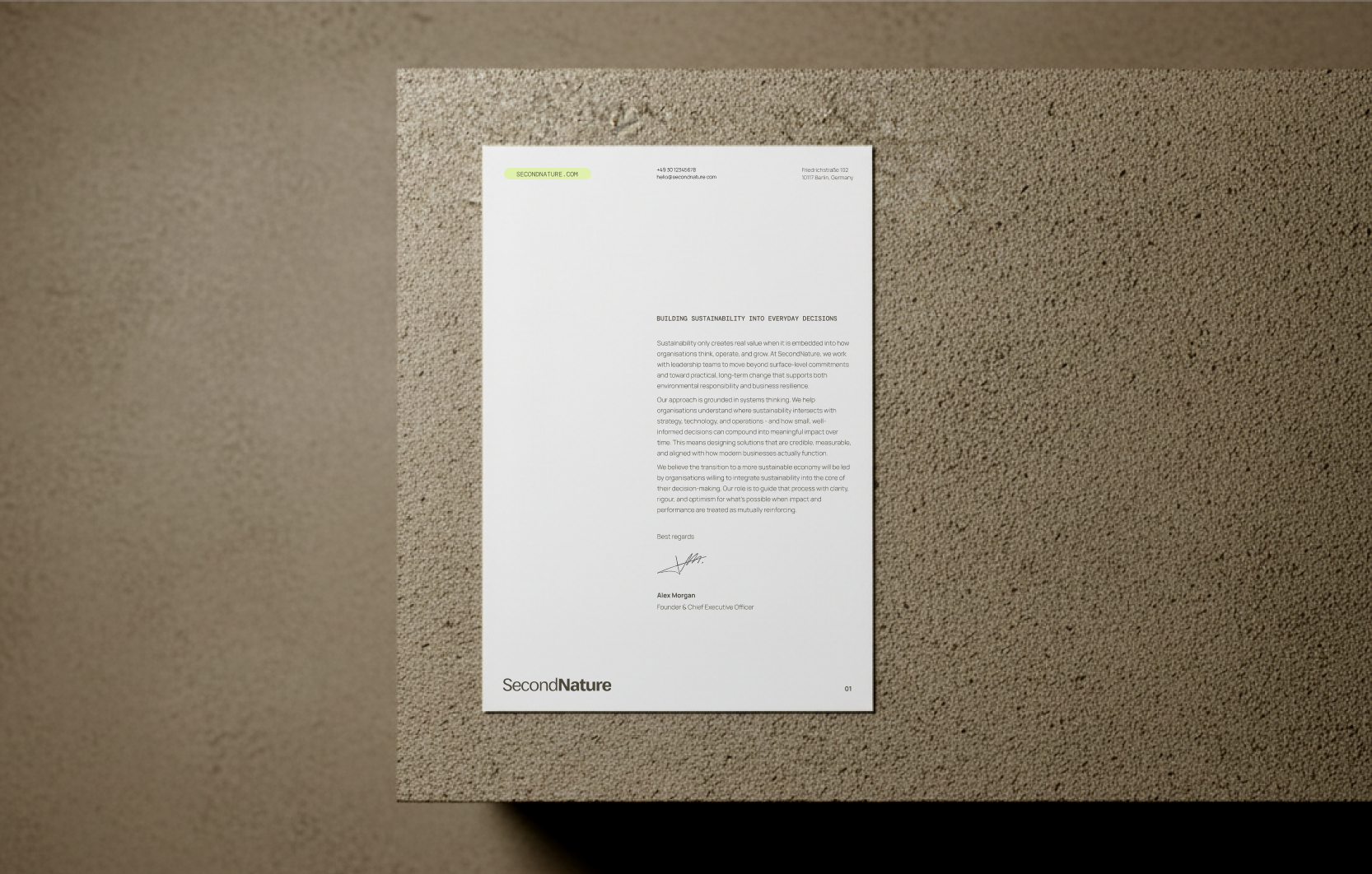
Letterhead
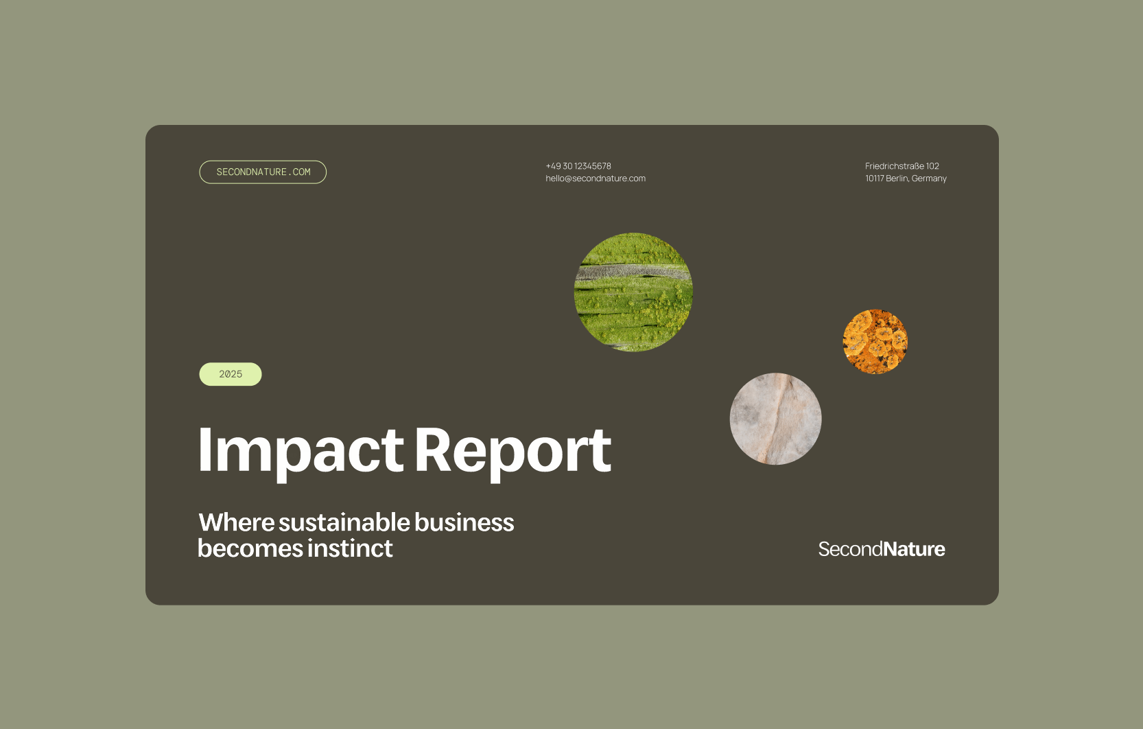
Pitch deck cover
Outcome
Although SecondNature is a self-initiated project, the website was featured on Internet Gems, a curated web design resource.
Start a project
Working within a complex or evolving sector?
We partner with people and organisations who need clarity, structure and a considered brand presence.